This label and packaging series was created by Caramba Agency Barcelona. Inspired by a color palette that reflects the essential elements of gin.
Colors

Light Cream
Evokes the purity and clarity of gin. It refers to distilled alcohol—clean, transparent, and refined.

Soft Yellow
Conveys natural freshness with a citrusy touch. Reminiscent of lemon peel or the slice of lemon in your gin and tonic.

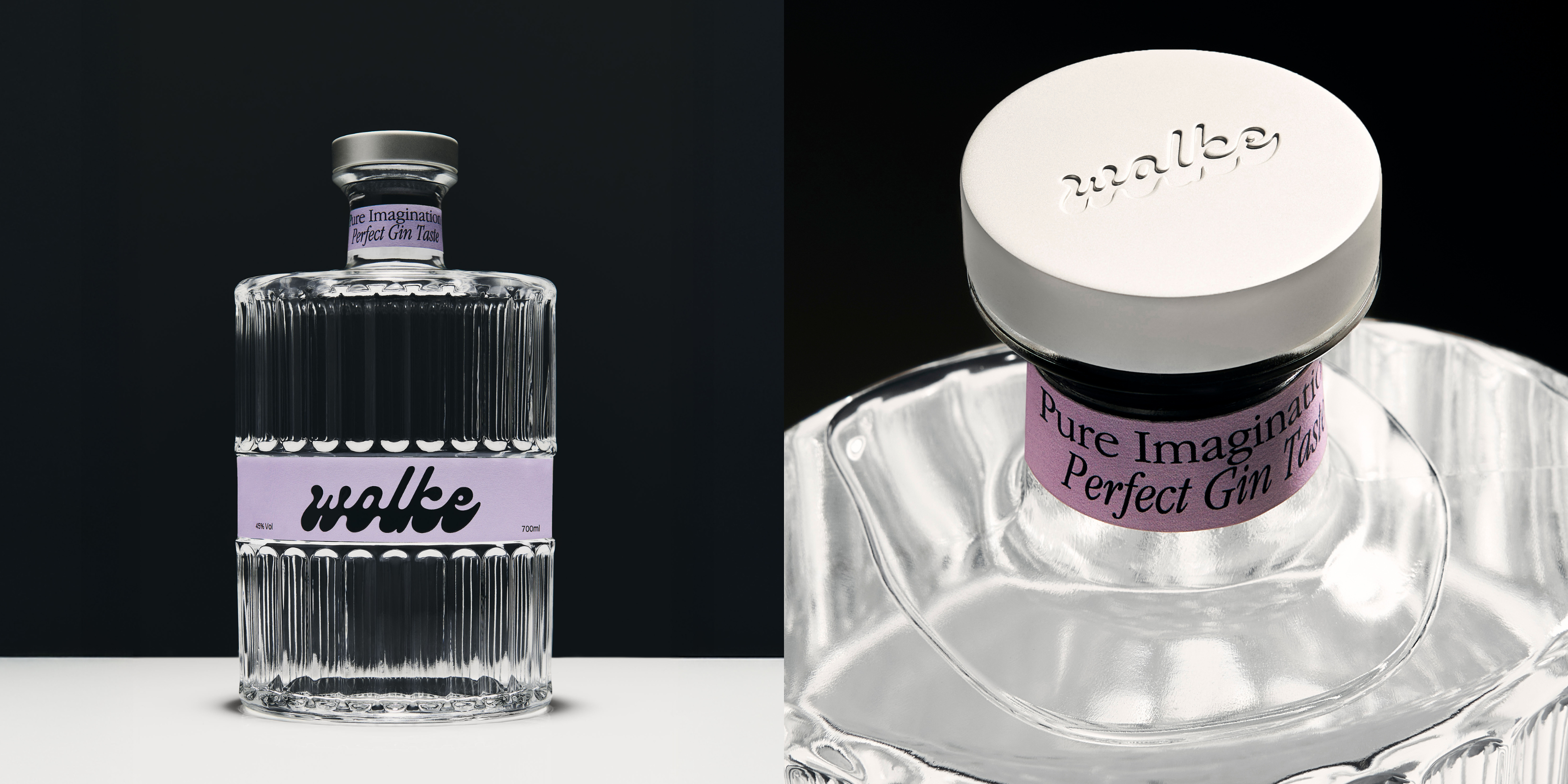
Light Lavender
Suggests floral and aromatic notes, adding a delicate and elegant nuance.

Soft Orange
Inspired by the peel of bitter orange or mandarin. Expresses energy, sophistication, and vibrancy.

Deep Burgundy
Reflects the aromatic depth of juniper and macerated fruits. Brings strength, richness, and visual impact to the brand.
